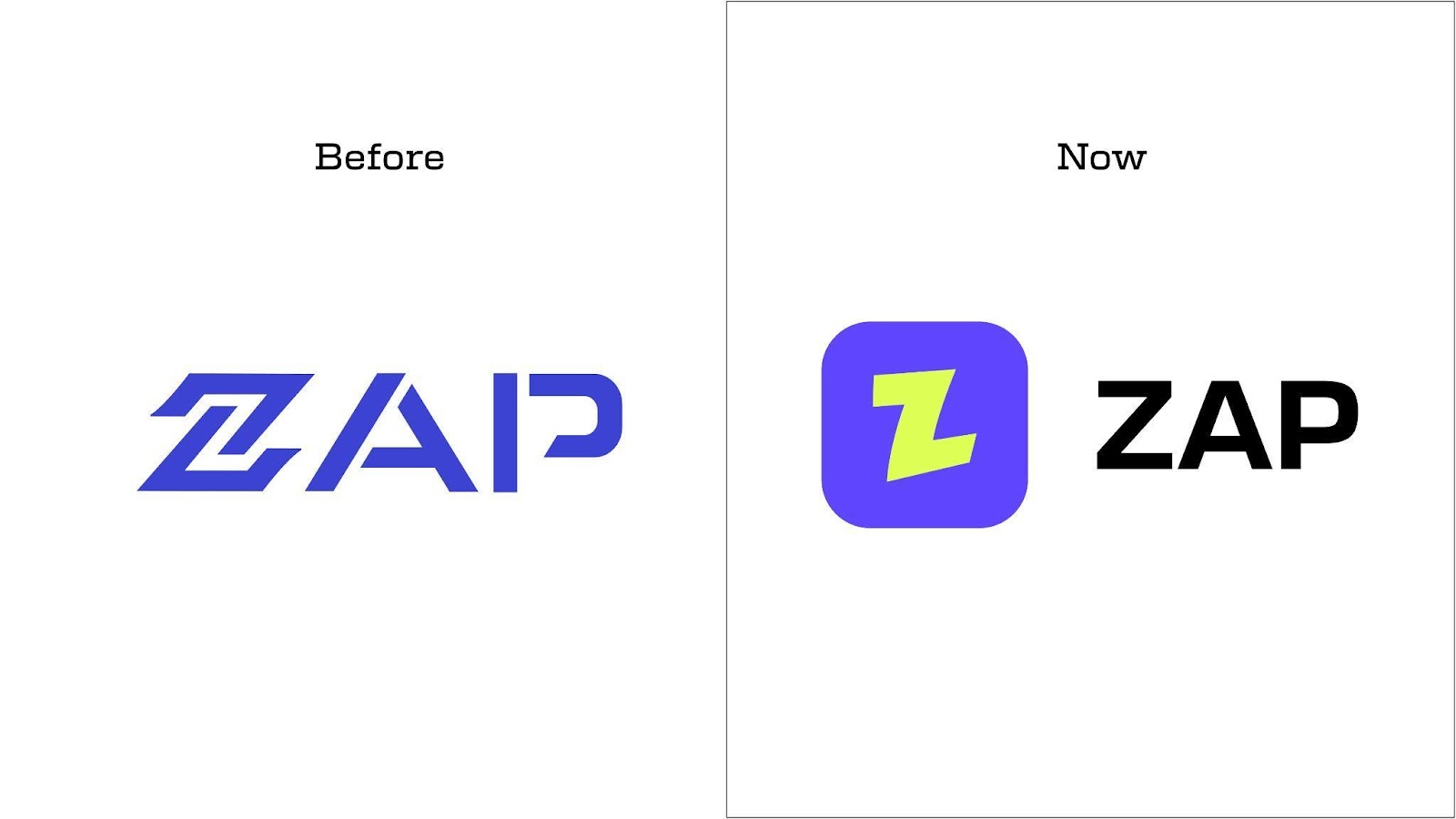
The Nigerian startup known for pioneering non-custodial crypto infrastructure has officially unveiled a full rebrand. This update isn’t just skin-deep. It includes a redesigned logo and a powerful upgrade to its flagship product, Zap Exchange—now sleeker, faster, and a whole lot more intuitive. Think of it as version 2.0 of both the brand and the experience.
For those who don’t know, Zap wasn’t built out of hype—it was born out of necessity. In a time when trust in centralized crypto platforms was crumbling like sandcastles at high tide, Zap stepped in with a mission: give control back to users. Let people swap, move, and spend their digital assets without third-party interference. Non-custodial. Fully user-driven. Fully transparent.
But while the platform was evolving and scaling with impressive momentum, the brand identity hadn’t kept up. The old look—a leftover from their MVP days—no longer reflected what Zap had become. The product had matured, the team had grown, and the vision had expanded. It was time for the branding to catch up.
Tobi Asu-Johnson, co-founder of Zap, puts it plainly: “As we scaled, it became clear our old design no longer reflected who we were. With Zap version 2 and our expansion plans, we needed a brand identity that reflects the innovation, ambition, and energy of the team today.”
This rebrand is more than a facelift — it’s a signal. A signal that Zap isn’t just building tools, it’s building the future of decentralized finance in Africa—and doing it with clarity, style, and serious ambition. If you’ve ever felt boxed in by the limitations of centralized platforms, Zap’s upgrade might be exactly what you’ve been waiting for.